City Branding
Anchorage AK


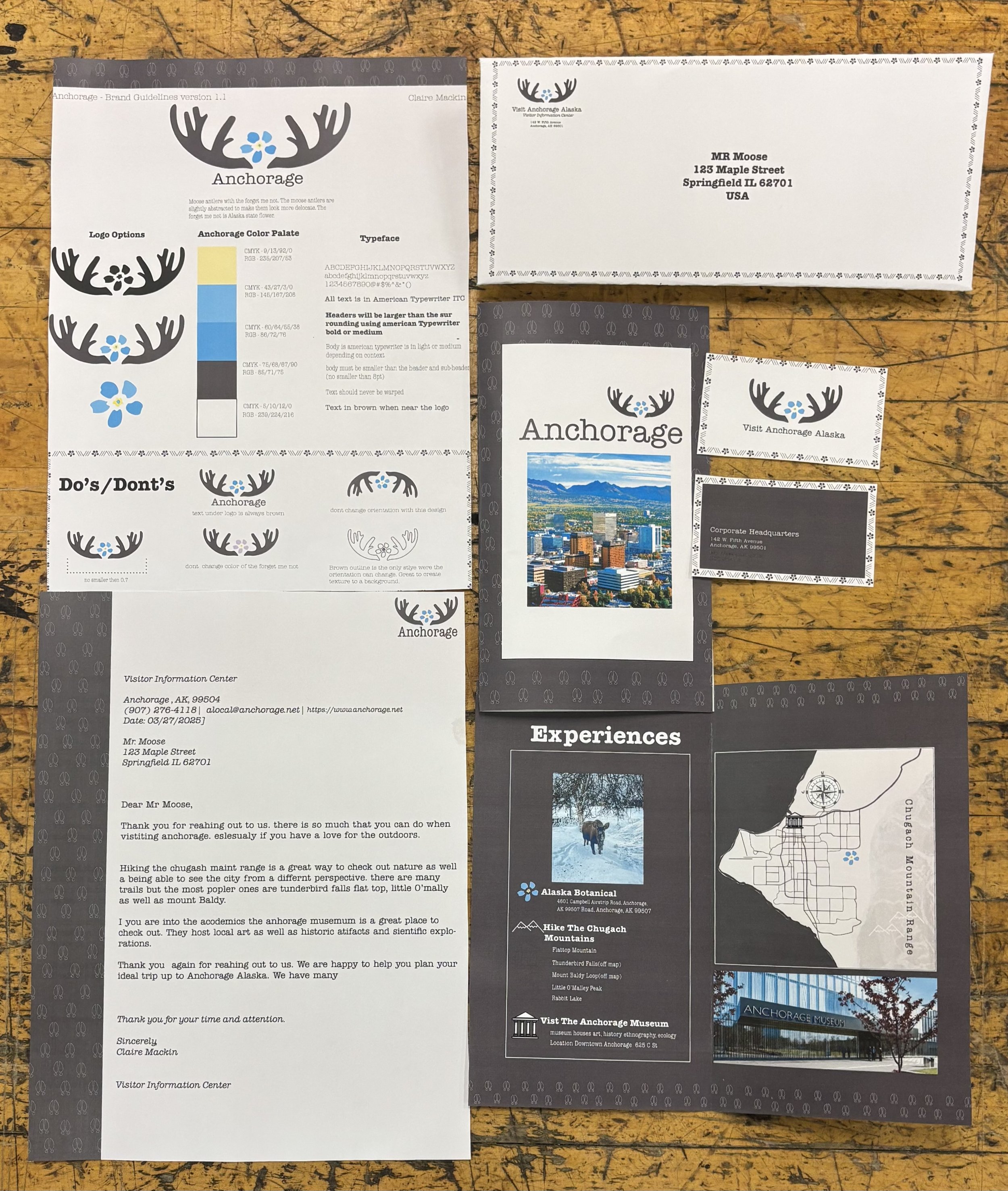
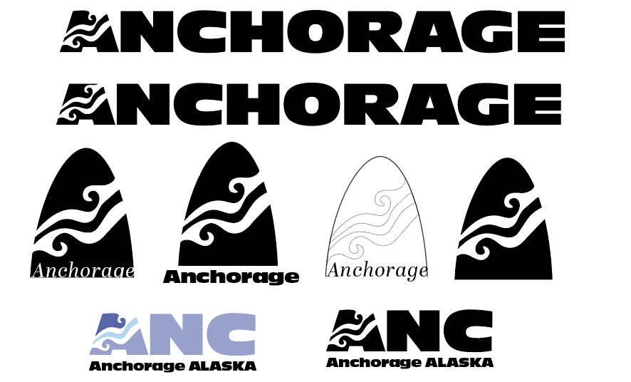
The purpose of this assignment was to develop a brand identity for a city. I chose Anchorage as my focus. The centerpiece of the project was the logo. After sketching multiple different concepts, I landed on a design with moose antlers and a forget-me-not flower in the center. I abstracted the antlers slightly, giving them a more delicate, refined look. To create balance, I include the forget-me-not, known as Alaska’s state flower. As I worked on the brochure, I began experimenting with using just the outline of the antlers and the flower. This approach allowed me to add variation to the brand while maintaining consistency, playing with line and shape throughout the different materials.
In the early stages, we brainstormed what the city represents as a whole, which helped guide the direction of my branding. I wanted the brand to have meaning and purpose, so I decided to target a specific audience: women. This choice helped me narrow down the aesthetic and focus my design decisions. This project taught me a lot about creating cohesion across various brand elements. At first, it was overwhelming, but once the ideas began to take shape, it became easier to organize them into a unified system. One of my favorite elements is the moose hoof print pattern I created for the inside of the envelope. I’m proud of the effort and creativity I put into this project, especially for the time we were given.
Process Work